In this project, I was given a hypothetical show to create a dynamic and pertinent title card. The show I was given was titled "Grease Fire: World's Top Culinary Competition. Taking inspiration from A24, I wanted to create a cinematic feeling title card. We began our project working with typographic elements, we then moved on to hand-lettering a logo and ending with a discussion about proven hierarchical techniques (rule of thirds and Fibonacci). Below you will see all versions of my hand-lettering and title card.

Above are the first versions of my title card. These were made before learning to digitize hand-lettering and create a more dynamic layout through hierarchy.


above are the first and final versions of my hand-lettered logo. I took inspiration from my original typeface in the title card design. Learning hand lettering and how to digitize after was very fun and much needed. I love lettering and wan to learn and practice more to improve my skills.

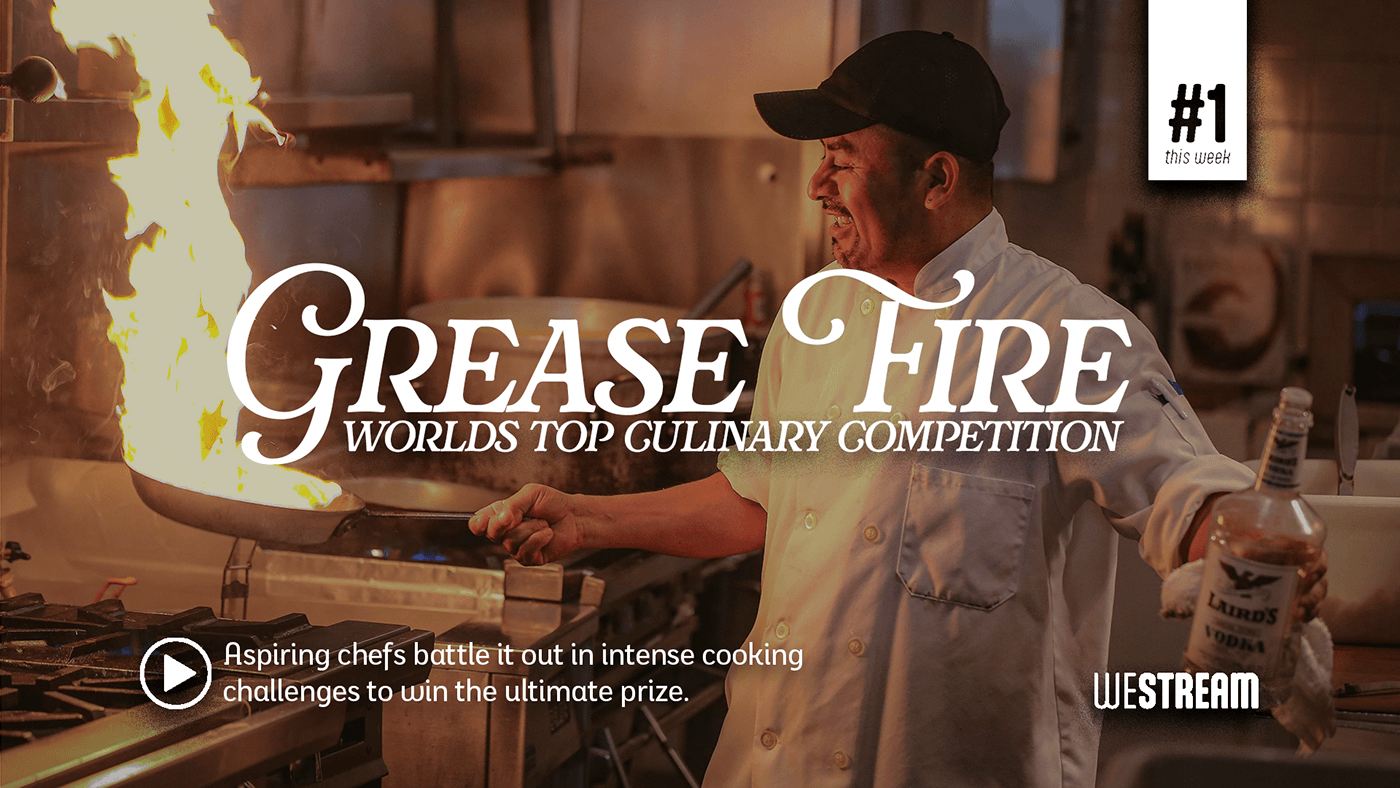
Above is a version of my title card using the hand-lettered logo. I prefer the type version but I am still proud of myself for learning and trying something new in this assignment. My final version of the hand-lettering was well-balanced and matched the show it was intended for. The weight is a little off which could be fixed with more versions and trial/error.


This is the final and most successful version of my title card. As you can see, I used to rule of thirds to create a piece that was more visually structured and had a clear hierarchy. Learning to use the rule of thirds in a title card made my final iteration exhibit a dynamic and well-composed layout. The only thing I would go back and fix is some kerning and leading.

